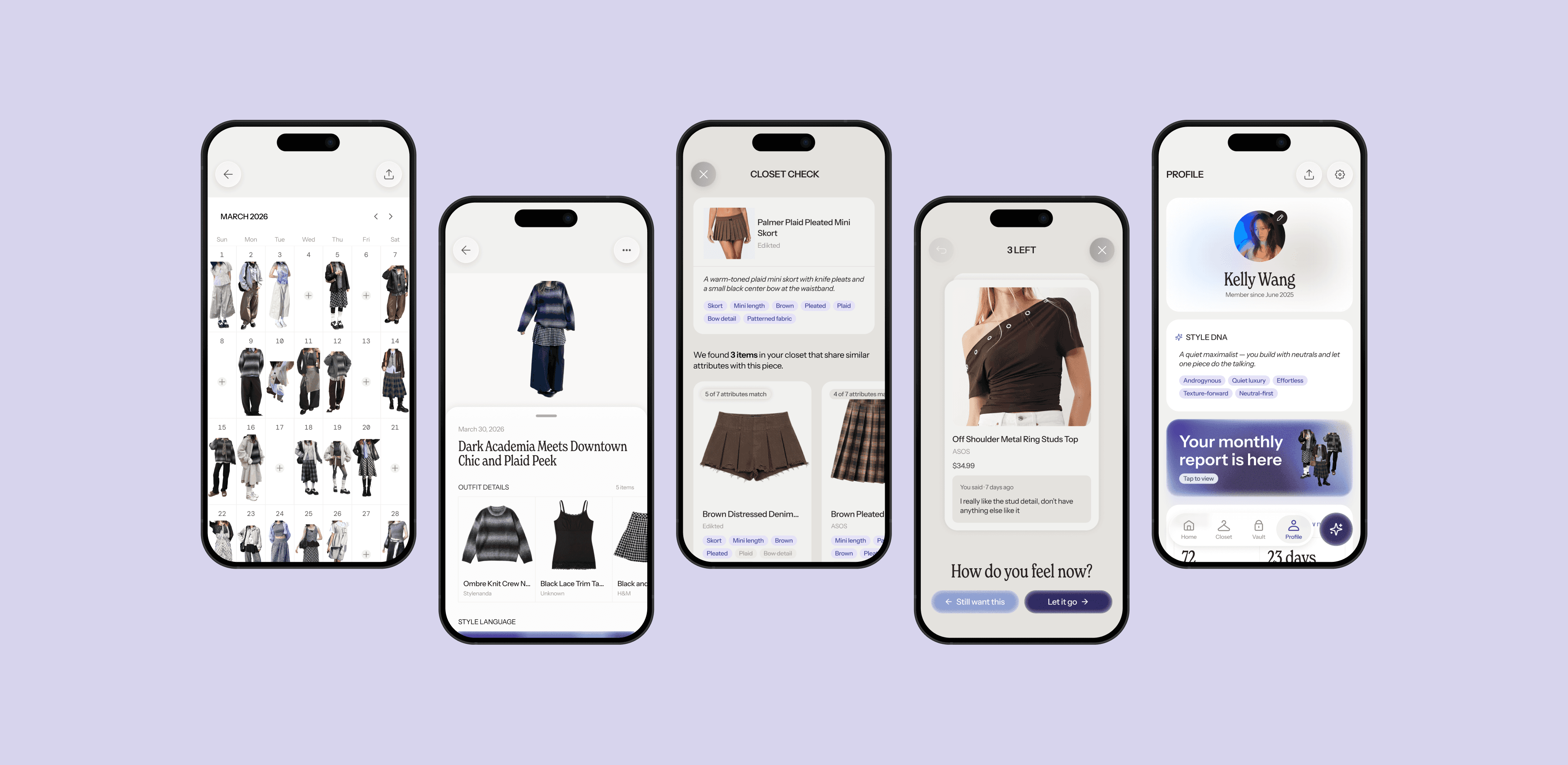
Context
It all started with a shopping problem I kept ignoring: I kept buying clothes that were nearly identical to what I already owned.
Fashion has always been my my favorite form of self-expression.
But after years of shopping, I started noticing patterns. I'd bring something home only to realize I already owned something similar. I'd go on a thrift store run, filling my cart with pieces that felt exciting in the moment, only to donate them back to that same store months later. Sometimes I'd open a shopping app and check out before really thinking about if I wanted the pieces in my cart.
pPrimary goal
How might we help users track and recall what they own so their closet stops feeling like a mystery?
Downstream goal
How might we build in more pause, enough space between impulse and purchase, to make a decision users won't regret later?
Solution Overview


Your entire wardrobe, finally in one place.
Add your clothes once and log your outfits daily. Mirror organizes everything automatically, learns your style, and builds a living picture of what you actually own and wear.
Shop with your whole closet open.
Wondering if you already own something like this? Closet Check compares a potential purchase against your existing wardrobe in seconds.


Want something bad enough to wait for it?
Save any item to your Vault and Mirror will lock it away. When it resurfaces, you'll know if you actually want it—or if you just wanted it in the moment.
Research
Statistics show that the core problem is a lack of awareness into our wardrobes.
People are unaware of what they own
A survey by Vestiaire Collective showed that consumers underestimated what's actually in their wardrobe by 40%. Additionally, 84% report regularly feeling they have "nothing to wear" despite owning 100+ items on average (94% for Gen Z).
↓
Holding onto items we don’t wear + buying more than we need
21–29% of women and 15-17% of men (UK and US) admit to often buying clothes they never wear.
Early Ideas
My first idea: prevent over-purchasing with a duplicate detection tool that answers the question: Do you already own this?
My first concept was a two-part product: a mobile app paired with a browser extension.
The app was where users would upload and organize their wardrobe, building the closet data the system needed. The extension would then scan the user's wardrobe for similar pieces and surface them right in the browser.
I used Figma Make to move fast on this idea, going from concept to clickable screens in just a quick afternoon instead of days.
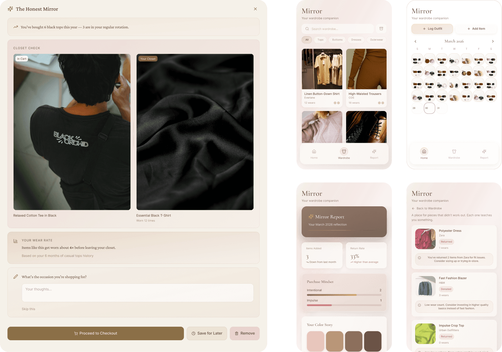
Figma Make's first attempt at my idea. The result was definitely a bit rough because I hadn't thought the concept through enough to prompt AI clearly.
But the moment of purchase was a symptom, not the problem.
The two-part structure also had a practical flaw: it asked for a lot of back and forth. The extension was only useful if a user had already uploaded their entire closet through the app, so the checkout intervention depended entirely on setup work happening somewhere else first.
That pointed to a deeper issue. The real gap wasn't at checkout, it was a lack of visibility into what already existed in the wardrobe, long before checkout ever entered the picture.
That realization pushed the product toward a mobile-first solution, where persistent data and daily context made a richer experience possible than a browser extension ever could.
Defining the Scope
The market is full of outward-facing apps telling you what to wear next.
Before committing to Mirror's features, I looked at what already exists in the wardrobe app space and a few stood out as worth studying. The value proposition of these apps was mainly about discovery, social sharing, or expert guidance.

Alta is an AI-forward stylist that suggests outfits based on your closet, budget, and the weather.
Personalized outfit recs
Virtual try-ons
Shopping suggestions

Indyx focuses heavily on community and sustainability through closet sharing and expert human styling.
Cost-per-wear tracking
Closet analytics
Wardrobe sharing

Lekondo positions itself as a "third space for fashion", less about organization and more about self-expression.
Outfit documenting
In-depth style breakdowns
Community lookbooks
Mirror needed to be inward-facing, designed to help users understand the relationship they already have with their closet before adding anything new to it.
I used this insight to define Mirror's scope:
Not an outfit suggestion app
Not a money saving app
Not a shopping recommendation engine
Not a social or sharing platform
That last point was an important one to make for me. Adding social features to a reflective tool tends to shift user behavior toward performance rather than self-awareness, which runs directly against what Mirror is trying to do.
I set four design principles to keep me anchored while moving forward.
I created design principles to guide my decisions throughout my project, including copy decisions, interaction patterns, visual hierarchy, and the overall information architecture.
01
Awareness over prescription
Mirror only reflects, not directs.
02
Non-judgmental tone
Interventions and insights are framed neutrally.
03
AI-enhanced, not AI-controlled
AI handles the tedious work so users can focus on making decisions.
04
Intentionality by design
Moments of pause are intentional and should not feel punitive.
UI Exploration
I turned to my newly acquired Claude plan for rapid design exploration before narrowing down.
I started in Figma with a clear direction in mind: a grounding palette of warm tones and overall vibes of soft glassmorphism, editorial, and modern.
After drafting key screens to establish the foundation, I used Claude Design to quickly explore UI directions.
It generated a wide range of options, some that stayed close to my original screens and some wildcards, giving me a broad surface area to pull inspiration from without having to build out every variation myself (which would have taken me days).

A handful of directions for the Closet Check and Vault features, generated in minutes
I didn't have a design system built out yet so the outputs didn't align with anything I'd already established.
But I wasn't looking for final screens, I was looking for layout ideas and UI patterns I hadn't considered. A few of those directions ended up shaping decisions I made later once I sat back down in Figma.
Feature Rundown
Mirror turns a personal wardrobe into a site of self-awareness and reflection: surfacing habits, detecting duplicate purchases before they happen, and creating space between wanting something and buying it.

Design Decisions
Closet Check and Vault were two features that forced me to think through logic, not just layout.
They're deeply connected: a clean Closet Check often leads straight into saving the item to the Vault. But they also need to work independently, since not every Closet Check ends in a save and not every Vault entry starts with a check.
Designing for both meant thinking carefully about entry points, friction, and what each feature is actually asking users to do at each step.
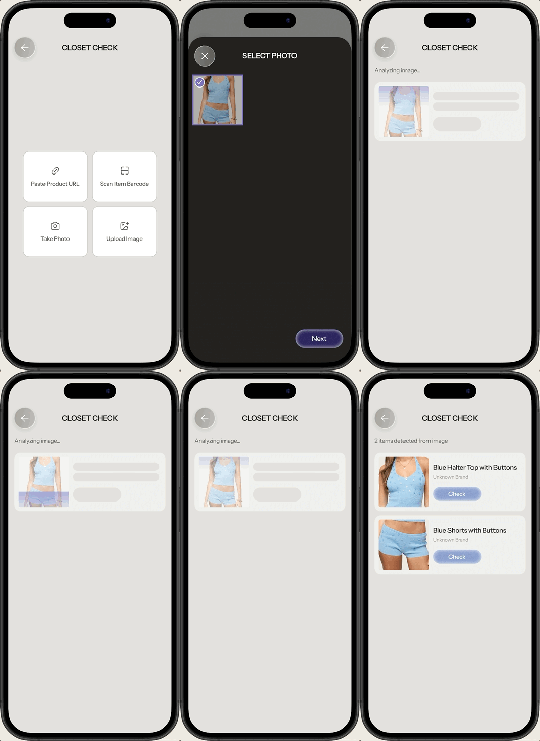
Designing Closet Check for multiple use cases
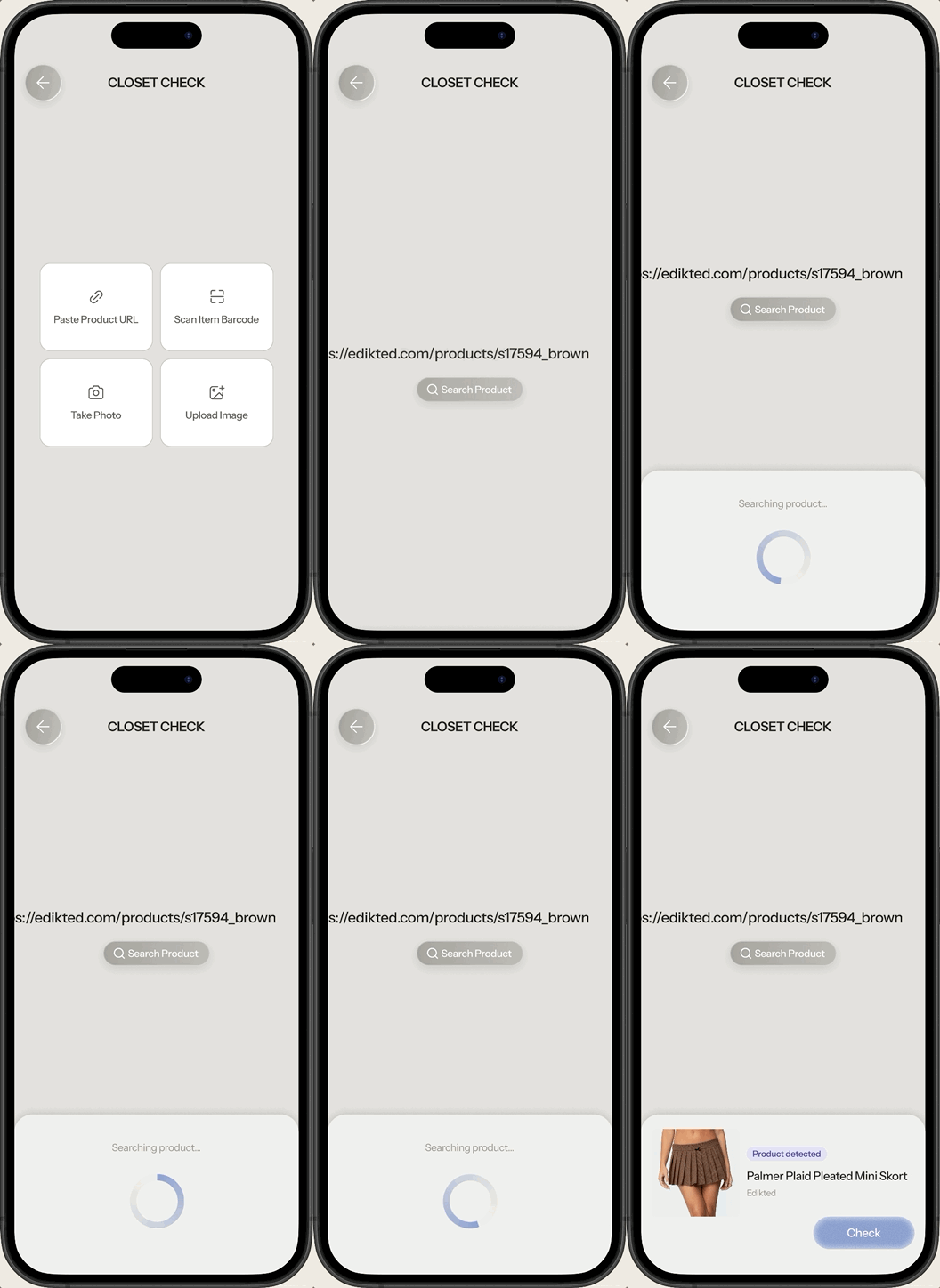
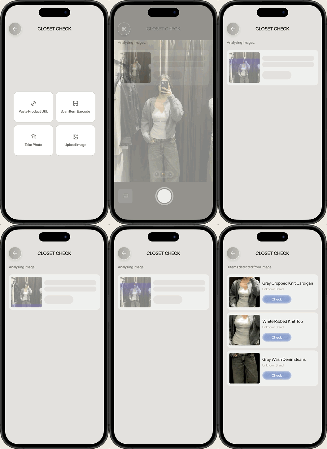
Closet Check needs to meet users wherever they're shopping. Online shoppers might have a product URL or screenshot on hand. Someone browsing in-store might want to scan a barcode or snap a quick photo.
Given this, I created entry points for each shopping context. The more frictionless it is to start a Closet Check, the more likely it becomes a default behavior rather than an extra step.

Reducing friction when locking items
Once someone decides to save something to the Vault, the goal is to capture that moment of intention without making it feel like homework. Locking happens in two parts. First: choosing how long to wait before revisiting the decision. Second: an optional note on why the piece caught attention in the first place, allowing users a moment of pause to reflect.

Issues
Four lock duration options with weak visual hierarchy, resulting in confusion or decision fatigue
Short text input creates extra work for users who just want to act quickly

Fixes
“Standard” shown as a visually larger option, making it the recommended default at a glance
Pills for easier selection, with optional text field for those who want to add more
Reframing two outcomes as one action
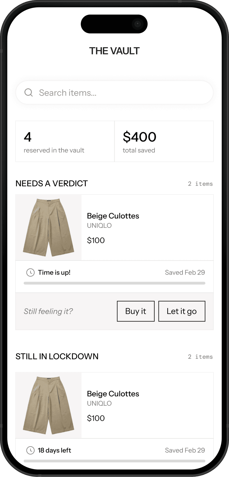
Once an item resurfaces from the Vault, there are only two options: buying it, or letting it go. But Mirror has no real connection to any external retailer, prospective items live as external links, not products inside the app, so "buying" was never something the app could actually do.
My fix was to treat both outcomes as the same kind of action: a dismissal. Whether someone still wants the item or has let it go, the Vault's job ends at the decision, not the transaction.
Issues
“Buy it” routes users externally to the product page, which disrupts the decision flow
List view of resurfaced items could grow crowded as items stack up, making each decision feel rushed
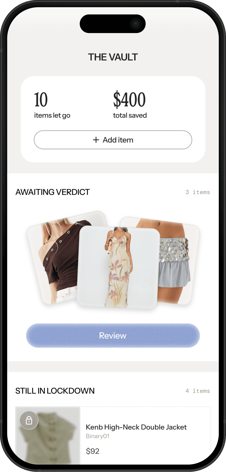
Fixes
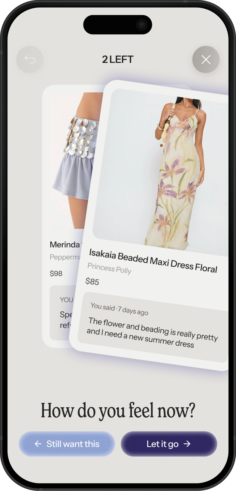
Users review items one-by-one, so each decision gets focused attention
“Buy it” changed to “Still want this”: Both actions simply dismiss the item, allowing the flow to move forward
Reflection
AI works best as a thinking partner, not just a production tool.
Mirror was my first real experiment with integrating AI tools into a design workflow, and it changed how I think about the early stages of a project. I found Claude most useful for brainstorming, pressure-testing ideas, and getting honest design feedback.
I also used Claude's design capabilities alongside Figma Make to explore visual direction early, which let me move into high-fidelity prototypes much faster than I would have otherwise.
I'm now learning to build what I designed with Claude Code.
I'm currently attempting to prototype Mirror using Claude Code (partly out of curiosity, partly just to practice vibe coding). It's been a humbling and genuinely fun experience.
Learning how to prompt correctly, structure files in a way that holds up over time, and manage token usage efficiently is its own skill set, and I'm very much still developing it. But watching a real working prototype take shape from a design I built entirely myself has made it one of the more satisfying parts of this project!
See Next

Zocdoc
Enhancing Zocdoc’s marketplace experiences through cross-functional collaboration, UX audits, and systematized design updates
Internship
Shipped 2025/2026

Revitalizing the UW Mitochondria and Metabolism Center (MMC) Website
End-to-end redesign of the MMC site, focusing on design modernization and improving information architecture
Contract
Shipped 2024